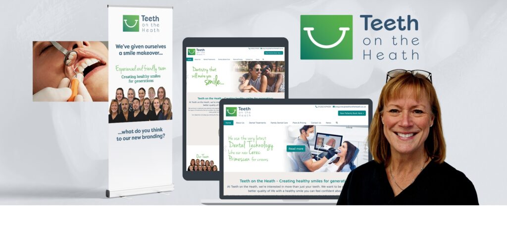
Teeth on The Heath, a well-established dental practice based in Poole, had built a strong reputation for quality patient care and a friendly, professional environment. However, over time, their brand identity had begun to feel dated, no longer fully reflecting the modern, approachable, and high-quality service they provided. In today’s competitive healthcare landscape, a contemporary and inviting brand image is crucial for attracting new patients and reinforcing trust with existing ones. The practice recognised the need to bring their visual identity up to date, ensuring it aligned with their current values and future aspirations.
Understanding the Difference: Brand Refresh vs. Rebrand
Before embarking on this journey, it’s important to clarify the distinction between a brand refresh and a rebrand:
· Brand Refresh: This involves updating and modernising existing brand elements while retaining the core identity and recognition. It’s an evolution, not a revolution. A refresh typically includes changes to elements like the logo, colour palette, typography, and messaging, but the fundamental name, mission, and overall essence of the brand remain consistent. The goal is to revitalise the brand, make it feel current, and better connect with its audience without alienating loyal customers. Think of it as giving your brand a facelift or a new outfit – it’s still the same person, just looking sharper and more contemporary.
· Rebrand: This is a more significant and fundamental strategic overhaul of a brand’s identity. It often involves changing the company’s name, mission, values, and a complete redesign of all visual and verbal elements. A rebrand is usually undertaken when a company undergoes a major strategic shift, merges with another entity, needs to distance itself from a negative reputation, or when its original identity no longer accurately represents what the business does. It’s akin to a complete transformation, where the brand is essentially reintroduced to the world on new terms.
For Teeth on The Heath, the objective was clear: they wanted to maintain their established reputation and patient loyalty while modernising their image. A brand refresh was precisely what was needed – an evolutionary step to enhance their existing, well-loved brand.
The Solution: A Fresh Look for a Trusted Practice
The brand refresh for Teeth on The Heath focused on key visual elements to create a cohesive, modern, and welcoming identity:
1. New, Fresh Logo: The existing logo was redesigned to be more contemporary, clean, and reflective of a modern dental practice. The new design aimed to convey professionalism, care, and a gentle approach, using updated aesthetics that appeal to today’s patients.
2. New Corporate Fonts: A selection of fresh, legible, and aesthetically pleasing corporate fonts was introduced. These fonts were chosen to complement the new logo and ensure consistency across all communications, from the website to patient forms, enhancing readability and conveying a modern feel.
3. Fresh Website Look: The practice’s website received a significant visual update. This involved incorporating the new logo and fonts, along with an updated colour scheme and improved layout. The aim was to create a more intuitive, visually appealing, and user-friendly online experience that accurately represented the practice’s refreshed image and commitment to patient comfort.
The Outcome: A Resonating Identity
The brand refresh was met with overwhelmingly positive feedback, both internally and externally. The new identity successfully captured the essence of Teeth on The Heath – a professional, caring, and modern dental practice.
“The new logo and branding refresh is just what we were looking for. All the staff and our strategic partners loved it and said it really made us look like the dentist practice we are – modern, caring, and professional.”
Ulrikia Skalberg, owner of Teeth on The Heath
This sentiment underscores the success of the refresh in aligning the brand’s external perception with its internal reality and aspirations. The updated identity not only enhanced the practice’s visual appeal but also reinforced its core values, ensuring it continues to attract and serve its community effectively.
The Power of Evolution
The case of Teeth on The Heath demonstrates the significant impact a well-executed brand refresh can have. By strategically updating key visual elements, the practice was able to revitalise its image, better reflect its current offerings, and strengthen its connection with patients, all while preserving the valuable equity of its established name. This refresh positions Teeth on The Heath for continued success in Poole’s dental landscape, proving that sometimes, evolution is the most powerful form of transformation.
